Hooking Up to the window.onscroll Event Without Killing Your Performance

Waterfall and FPS chart
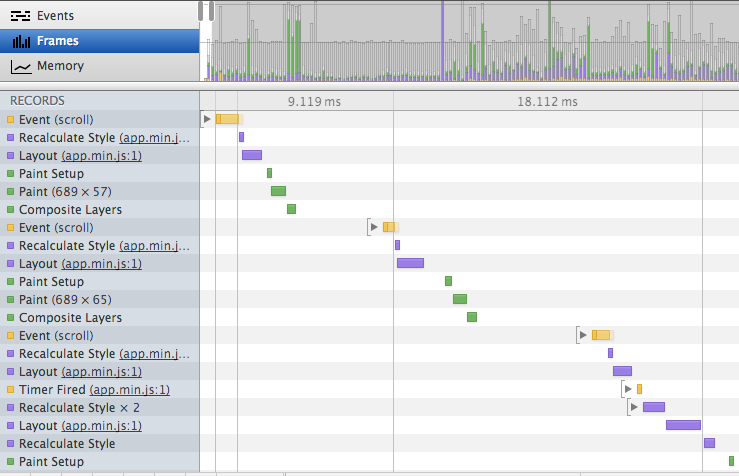
This week was my one-month anniversary at Lemonly, and in that month, I’ve used more onscroll event hooks than I have in the last 15 years of development, and for good reason. It’s a great way to add flair, track progress, or get parallax-y. If you don’t do it right, it’ll crush your site’s performance and irritate your users. So what’s the best way to hook up to the window.onscroll event and still maintain a reasonable frame-per-second rate when scrolling? Read More…

Introducing keycoop.com, A New Responsive Website

A new keycoop.comI launched a new website this week, keycoop.com. Go ahead and click on the link. Check it out. I’ll wait for you to come back. 🙂

Welcome back! This was a fun site to code. A few of the more interesting aspects include:

  • The main menu uses a 2D transform to give it a similar diagonal look to the logo.
  • If you’re in Chrome, you get to see a little eye candy as the hero image fades from 100% desaturation to 0%. I love CSS3 filters.
  • IE8 support is limited to functionality and a constrained single-column layout.

I was the front-end developer and UX manager on this project. That means I wrote 100% of the HTML, CSS, and JavaScript that wasn’t generated by our CMS.

As always, a shout out to the ever-impressive Emily Robinson for a beautiful design.

Love the site? Hate the site? Let me know what you think in the comments or on Twitter.

Differences in jQuery and Media Queries Are Fixed With window.matchMedia()

Browsers rendering the page differently at the same resolution.
Recently, I discovered that the mobile menu solution that we use for our responsive designs (Matt Kersley’s Responsive Menu) is switching the menu to mobile earlier than anticipated in Firefox and IE10 (you can see the differences in the graphic above). After digging, I found it’s because the plugin is using the jQuery API’s .width() function to find $(window).width(). In Firefox and IE10, it follows the spec and includes the vertical scrollbar in that calculation. Webkit (Chrome and Safari) and IE8 don’t include the scrollbar width.The real problem is that no browser includes the scrollbar width when calculating width for use in media queries such as

@media only screen and (min-width:768px) {}

The repercussion of that is the JavaScript spec and the CSS spec calculate width differently. Yikes. Even worse, the different browsers calculate $(window).width() differently. Luckily there’s a solution for that very problem. Read More…